Tag Archives: color

Monday’s Most Interesting Pinterests: Festival Graphics

When Felix started re-branding Heaven Fest for 2012,  I threw a Pinterest board together to show him things I like.

We are simplifying the look a bit.  Think Mac.  Cleaner.  Pure color (not grayed over, nor muted, pul-eeze).  But putting the Pinterest board together was just bringing various things that struck-my-fancy to one spot, my fancies (not Heaven Fest’s ,necessarily).   When I think festival branding, these things all have a tiny piece of it in my collaged-head. You can see the whole board here:

http://pinterest.com/jeanierhoades/festival-graphics/


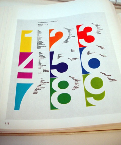
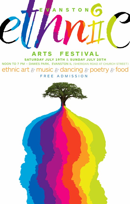
SOME OF MY FAVS-

(CLICK ON IMAGES to go to source)

I spent years liking muted color (think antiques, think Starbucks-coffee-house colors).  And while I still appreciate sort of the aged sophistication of those colors, I have increasingly been drawn to pure, bright color.

Blue and yellow apparently draws my eye, too.

I was a young girl during the birth of the Jesus-People Movement.

During 7th grade, I got to board a psychedelic-painted church bus and travel downtown to Christian Coffee Houses where the “One-way” chant became our cry.  Songs reminded us there was only one-one God-one book “and that’s the Holy Bible” to get us to the promised land!  There was a zealous passion of Jesus during that time.  The media took notice.

My dad made me come out of my room to watch 3 televised days of Explo ’72 in Dallas.  I was hooked after 5 minutes and it was the first time I realized I was part of a huge move of God in the earth.  I wasn’t alone, just a little Christian girl in a small church in my small city.  People everywhere loved Jesus.  It was there I first heard/saw:  Give me a J…give me an E…Give me an S…Give me another S….what’s it spell?….J E S U S….the crowds would yell, over and over.

Heaven Fest was being birthed in my heart in those days.  I secretly want to lead a Jesus chant.  Shhhhh….

Woodstock.  Started it all.

For Heaven Fest 2013, I so wish I could use this poster.

Except it would be “One day, one stage, one purpose.”  See how it is all coming together?  :)

Oranges are a draw for me.

I am not sure why I wanted the Vertigo poster on my Festival Graphics Pinterest Board, but I think it is amazing design.

Why – it is Heaven Fest!

I found this recently and have dubbed it “Heaven Fest Hair.”

I hope some one really does this and I get to meet them.

The difference between my Pinterest Board and my actual mind?  The thoughts, ideas and images in my thoughts swirl in a colorful collage of layers.  Think of photos, stacked, overlapping, constantly moving.  That is my actual Thought-Collage.

Happy Monday!

Dandelion

OK, so Pantone has named Mimosa the 2009 color of the year (I have mentioned it here and here), but Mimosa doesn’t grow here.  Dandelions do, though. 

So perhaps my color of the year will be “dandelion.”  And that is happy, too, even though sometimes they have made me crazy.  If it weren’t for the HOA, wouldn’t we let them have their way?


pictured: mimosa, left; dandelion, right

Pearl’s House of Many Colors – Home Tour


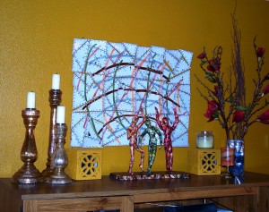
You’d hardly know from meeting Pearl of Denver, with her gentle spirit and quiet ways, that she is an adventurer with color and art and creativity.  She is always looking for the next  outlet for her artistic ability.  Her home is an ever-changing palette of color and fun, something she has passed to her two children.  Like Bryan said recently, “Beige has been forever banished from our home.”

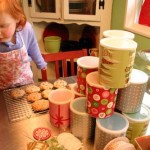
In the photo above, you see the cannisters, on display atop Pearl’s kitchen cupboards, that her parents received as a wedding gift more than 44 yers ago.  Pearl’s mom was  going to get rid of them before Pearl and Bryan got married, but saved them for Pearl at her request.   They are beautiful and  treasured for the memories they invoke.

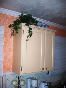
I love the pictured, beautifully painted, cupboard (below).  The smaller one on the right was there, but they picked up the wider cupboard at a garage sale.  Added trim, new hardware and a paint job making them look like a custom cabinet.  It works!  


In the living room, Pearl displays art projects by both her married daughter and herself.  Pearl’s latest piece of art is carved foam, done with relief technique.  You can read more about it here.  Pearl was noticing how different the colors look in digital photos from real life.  But I have seen both.  And she is brave and has created a fun home!


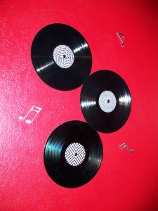
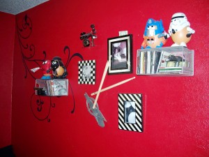
Pearl created  her son’s room to reflect his main interest:  music.  Steven, a high school-aged drummer, guitarist, composer  has a red red room with musical notes and records adorning the walls.  His drum wall has the coolest tree silhouette painting and there are flourishes in black painted throughout.


Click on the images for a better look.  And call Pearl if you’d like really cool images painted on your walls!  She is good, really, really good!

I love that Pearl surrounds herself with color and vivaciousness for living.  I love that her canvas is her home, for the love of her family!

How much do you think I am loving that orange hallway?…Jeanie

NOTE TO SELF: let the color-monster inside run free!…

I have worked with Pearl on church projects

Real Houses, Real People

Stephanie Nielson of Arizona, or Nie Nie as she is known to her blog readers (and there are gazillions, it would seem!) had her home chosen as the #1 Home of the Year by Cookie Magazine (“All the Best for your Family”).  See the whole description from Cookie’s decorating blog and lots more pictures here.

I love that she is young and has 4 kids and wasn’t some big crafter-decorator, but let her growing family and the personalities of her children sort of nurture that side of her.  Check out these cool ideas from a real family!


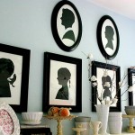
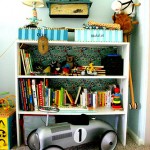
Check out the living room: no curtains or shades!  She isn’t worrying herself to death with how to stylishly cover her windows and the light shines in – on purpose!  I love the redhead on the couch!  The silhouettes are actually photo cut-outs painted black.  She updates them for her whole family annually!  And the shelves are lined in glued-on Old Navy gift wrap (click on the thumbnails above for a better look).


OK – look at the crib.  No, look more closely.  See the “garland” draping it?  They are the shrunken sweaters her mother wore growing up in the 50s and which she and her sisters dressed their dolls as they grew up.  Now they adorn the crib and I think it is genius!  I had all these baby clothes from Dave’s beginning and a couple of mine and never quite knew what to do with them.  LOVE IT!  And a kitchen wall lined with photos of the babes?  Have ALWAYS dreamed of doing that and covering with those 4′ x 8′ sheets of acrylic you can get at any home store to protect.  Someday….Stormie seriously loves that stainless-steel table (on top of an old dining table??) and the red chairs.
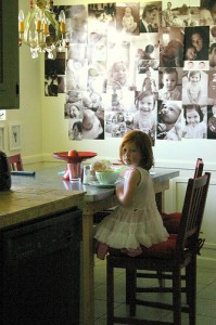
Here are more pictures from her personal blog:


I see color.  So great!  I wish I’d have been as brave at her age!  But all of you youngsters out there: get nesting!  In color!

????????

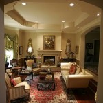
Or, if you prefer, some current “magazine-worthy” showhomes:


Be real.  Use your stuff.  It’s you!…Jeanie

NOTE TO SELF:  Unpack and re-evaluate things I love, but are carefully stored away.  Can they be loved in broad daylight?

NOTE TO READERS:  Send me pictures of your home-sweet-home space that really, truly and honestly reflect you, the real you and let me share them!  jeanierhoades@yahoo.com